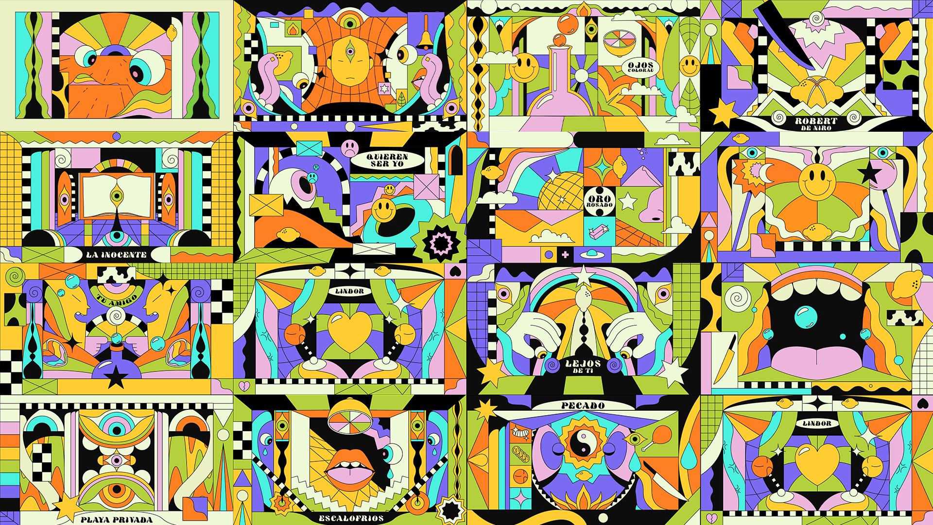
For the release of Microdosis, Puerto Rican singer, songwriter, and producer Mora (10.9B+ Spotify streams and counting) needed a visual system that could hold hands with hallucination, but still look good projected 40 feet wide in a packed stadium.
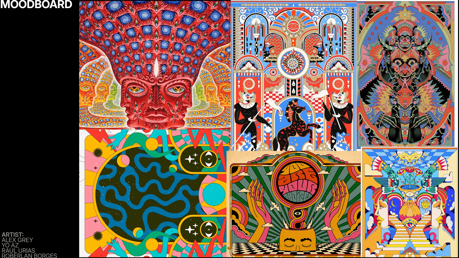
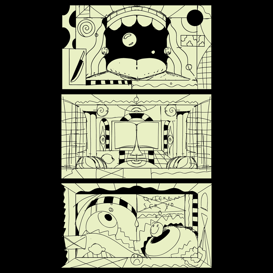
Every song on the album was inspired by a different drug. No metaphors, no poetry, actual substances. Mora handed us the full list. Our job was to translate altered consciousness into an aesthetic that was digestible, playful, and bold enough to match the emotional grit of the album, without sliding into cliché or chaos.
The Challenge
Make it weird, wild, and efficient. Mora's team needed visuals that could scale across LED walls, stage projections, social media, and merch. The visuals had to hit hard live, loop clean, and vibe with Mora’s dark-slick reggaetón aesthetic: introspective, trippy, high-gloss but still underground.

The Visual Trip That Took Mora Global
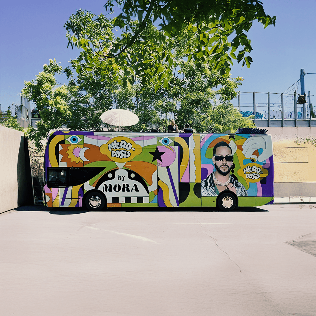
The release of Microdosis marked a turning point in Mora’s career, debuting at #1 on Apple Music’s Latin Albums chart and reinforcing his status as a global reggaetón force. My visual direction played a critical role in that moment, transforming the album into an immersive, multi-sensory experience that extended beyond audio. The artwork became the face of the campaign, featured across stage projections, digital assets, mobile promo trucks in Spain, and ultimately scaling into Mora’s global tour. Critics and fans alike called Microdosis a “visual album,” proving that the aesthetic wasn’t just support, it was central to the story.